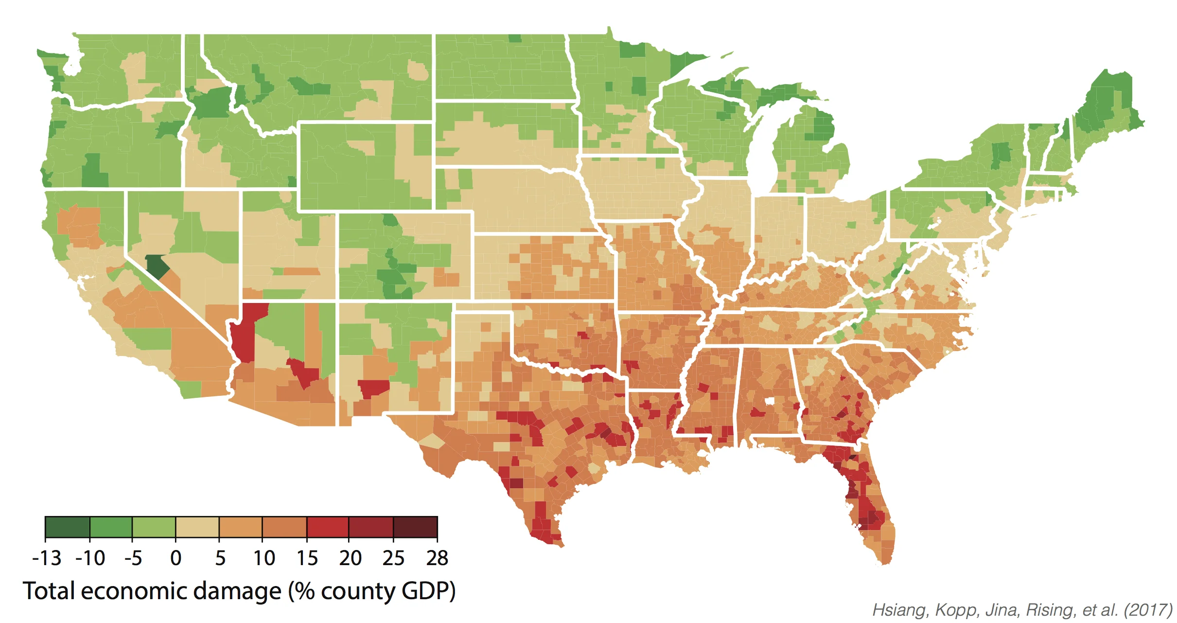


County-level annual damages in median scenario for climate during 2080-2099 under business-as-usual emissions trajectory (RCP8.5). Negative damages indicate economic benefits. Map corresponds with Figure 2I in main article.
Range of economic damages per year for groupings of US counties, based on their income (29,000 simulations for each of 3,143 counties). The poorest 10% of counties are the leftmost box plot. The richest 10% are the rightmost box plot. Damages are fraction of county income. White lines are median estimates, boxes show the inner 66% of possible outcomes, outer whiskers are inner 90% of possible outcomes. This figure is a simplified version of Figure 5C in the main article.
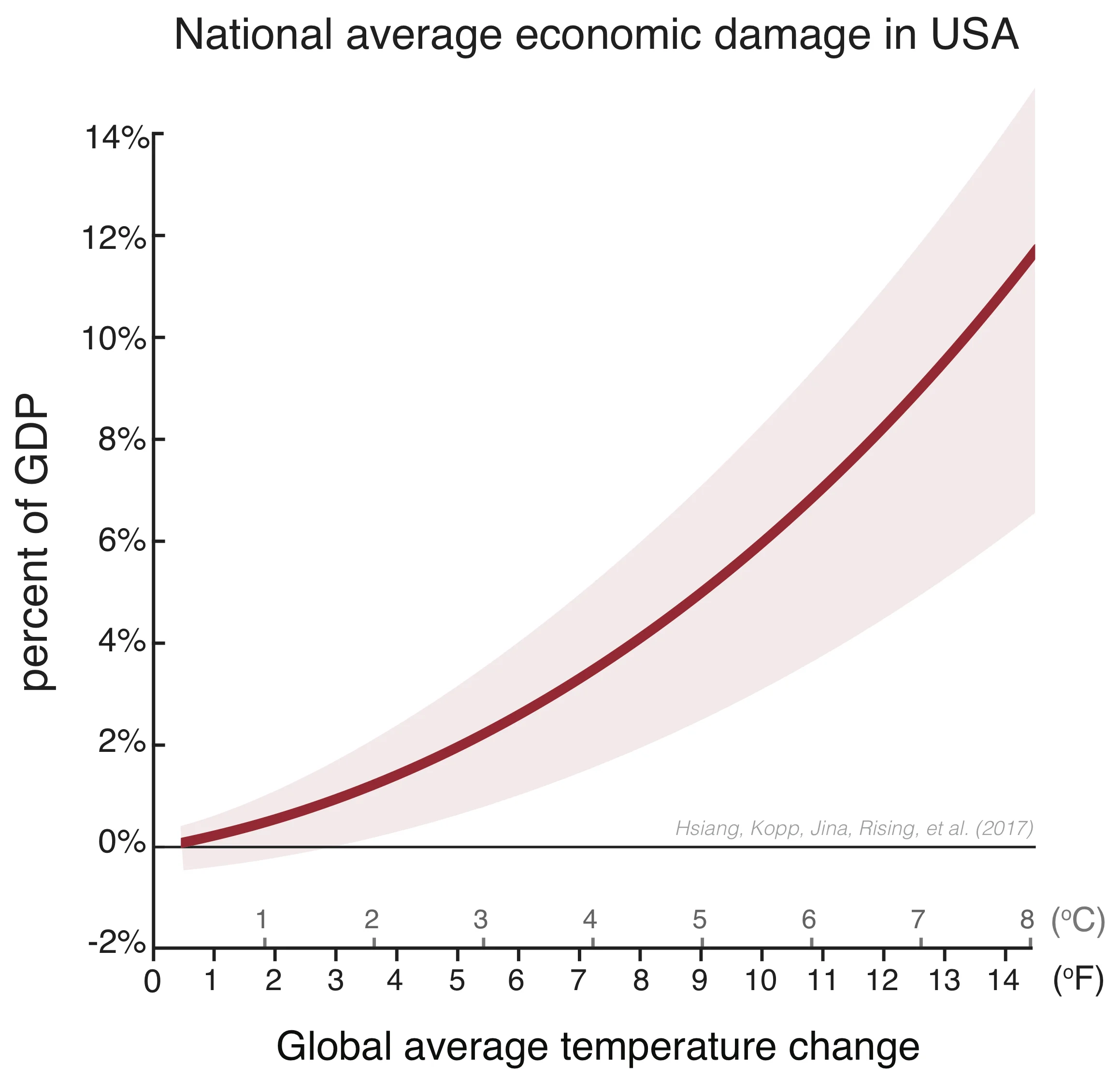
Estimated total direct damage to US economy per year in response to global mean temperature changes (horizontal axis). The red line is average losses across 29,000 simulations. The shaded region marks the 90% confidence interval across simulations (there is a 90% chance a simulation lands in this region). This graph corresponds with Figure 5A in the main article.
Estimated total direct damage to US economy per year in response to global mean temperature changes (horizontal axis). The red line is average losses across 29,000 simulations. The shaded region marks the 90% confidence interval across simulations (there is a 90% chance a simulation lands in this region). This graph corresponds with Figure 5A in the main article.
County-level annual damages in median scenario for climate during 2080-2099 under a business-as-usual emissions trajectory (RCP8.5). Negative damages indicate benefits. From left to right, top to bottom: percent change in yields, averaged for maize, wheat, soybeans, and cotton; changes in all-cause mortality rates, across all age groups; change in electricity demand; change in labor supply of full-time equivalent workers for low risk jobs where workers are minimally exposed to outdoor temperature; same as previous except for high risk jobs where workers are heavily exposed to outdoor temperatures; change in damages from coastal storms and sea level rise; changes in violent crime rates; changes in property crime rates; median total direct economic damage across all sectors. Maps corresponds with Figure 2 in main article.
Simulations of areas inundated by 1-in-100 year floods under median sea level rise under business-as-usual (RCP8.5) warming, accounting for forecast changes in tropical cyclone activity. The analysis covered the entire US coast, this image is for New York, NY. These correspond with Figure 4B and 4D in the main article.
Simulations of areas inundated by 1-in-100 year floods under median sea level rise under business-as-usual (RCP8.5) warming, accounting for forecast changes in tropical cyclone activity. The analysis covered the entire US coast, this image is for Miami, FL. These correspond with Figure 4B and 4D in the main article.
Simulations of areas inundated by 1-in-100 year floods under median sea level rise under business-as-usual (RCP8.5) warming, accounting for forecast changes in tropical cyclone activity. The analysis covered the entire US coast, this image is for Norfolk, VA. These correspond with Figure 4B and 4D in the main article.
Simulations of areas inundated by 1-in-100 year floods under median sea level rise under business-as-usual (RCP8.5) warming, accounting for forecast changes in tropical cyclone activity. The analysis covered the entire US coast, this image is for Houston, TX. These correspond with Figure 4B and 4D in the main article.
Simulations of areas inundated by 1-in-100 year floods under median sea level rise under business-as-usual (RCP8.5) warming, accounting for forecast changes in tropical cyclone activity. The analysis covered the entire US coast, this image is for Washington, DC. These correspond with Figure 4B and 4D in the main article.
44 climate models (outlined maps) and model surrogates (dimmed maps) are weighted so the distribution of the range of 2080-2099 global mean surface temperature changes match the probability distribution of estimated changes based on climate sensitivity estimates (blue-grey line) under a business-as-usual emissions trajectory (RCP8.5). Image corresponds with Figure 1A in the main article.